From locating the nearest doctors and healthcare providers to scheduling appointments and paying bills online, patients are increasingly turning to the internet to find their healthcare providers and interact with them. Therefore, a solid web presence is essential for all healthcare organizations. A good medical website design provides a good user experience, and enables patients to easily communicate with their physicians. A medical website customized according to your specialty and services is important to make your healthcare business visible to potential and existing patients. It is also important to build and manage your website adhering to the best practice guidelines.
Mark Brinker, the president of Mark Brinker & Associates, studied 1,100 medical websites. After analyzing all the websites he found that:
- Many healthcare businesses are doing well with their websites. They have a modern website design standard that provides excellent user experience to potential patients.
- There were many bad medical websites also that were difficult to understand or use.
From Mark Brinker’s analysis, the following are some of the mistakes one should be careful to avoid while developing a medical website.
- Using outdated design: Outdated design elements such as using unpleasant colours, cluttered pages with insufficient white space, pages with excessive white space, non-proportionate web pages, unconventional page layouts etc are a big turn-off for potential patients. Such outdated designs create the impression that web owners are not concerned about having a good website or providing excellent user experience to visiting healthcare consumers.
- Websites that are not mobile-friendly: Today, having a responsive website has become a necessity for almost all healthcare organizations as more number of people use mobiles to go online. Mobile-friendly websites went mainstream around 2013-2014, and in late 2016, web visits from mobile and tablet traffic surpassed desktop web visits for the first time. Websites that are not mobile friendly are likely to experience reduced visitor traffic and conversions. Moreover, Google also prefers mobile-friendly web designs.

- Use of wrong fonts: Make sure that the font size and style are modern throughout the website. Do not use fonts such as Comic Sans on your website as it looks very informal and inappropriate. Font size is also important for a website. The common size of the font is 16 to 20 pixels, some websites use 11 to 12 pixels but it is very small.
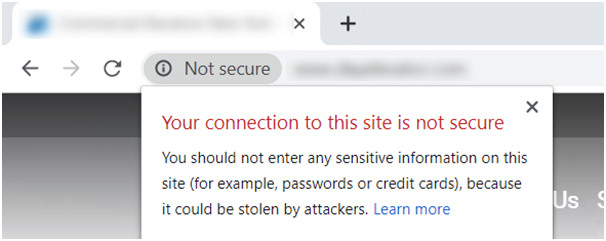
- Not using HTTPs protocol: No matter whether you are selling things online or not, it is important to have a secure website. Pages that are secure can be identified easily because they appear with a padlock sign in the web browser. In late 2017, Google Chrome browser started showing a non-secure error for simple contact forms and search fields on sites not using the HTTPS protocol.

- Bad choice of imagery: Being creative on your website is important. Sometimes websites use low quality pictures or may use wrong pictures of the messages you are trying to convey. Some websites use the same stock imagery with the same models that you have seen so many times before. It is ok to use stock imagery but using high quality images is important.
- Unintelligible messaging: From the analysis, many websites do not exactly mention the doctor or the kind of service they provide. Today, potential patients look for quick information and they do not have the time for speculation. So, it is important to ensure that there is clarity about the doctors and services a medical organization offers through their website. It enables easy communication between the potential patients and the medical organization.
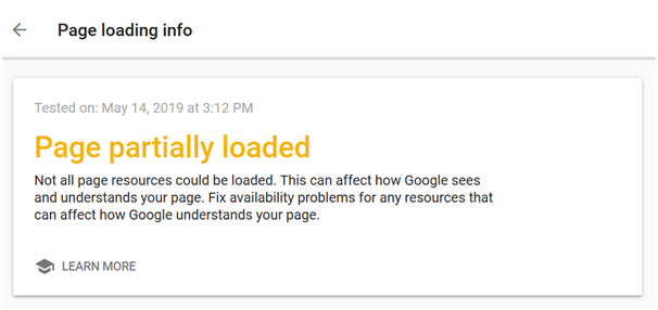
- Poor loading time: Just like responsiveness of the website, quick loading of web page is also important. The website should load in 3 seconds or less, be it desktop, mobile phones or laptops. Pages that take longer to load could result in rising bounce rate. Three common reasons for poor loading speed are cheap web hosting, bloated code and non-optimized images.

- Starting below the fold: Your ad copy should always be above the fold to ensure maximum click-through rate. The click-through yield on ads below the fold is lower.
- Using Adobe Flash videos or animations: Adobe Flash has been in the market for a long time. In 2015, Apple announced that they no longer use Adobe Flash and the significance of Adobe Flash is dying gradually.
- Do not stuff keywords: Stuffing keywords is one of the most common reasons for Google to penalize your website. Google is well aware of this technique and it devalues the website.
- Old copyright date: There are many websites with old copyright date. There are many websites with copyright dates of 2009, 2010 etc and this makes you wonder whether the business is still running or not. So, don’t give your visitors a reason to doubt you. Make sure your website shows the current year in the footer.

- Excessive animation: Here the animation refers to CSS style (cascading style sheets). CSS animation allows you to create motion and transition effects on your website to jazz it up a little bit. But sometimes websites overuse CSS animation and this weakens the overall image of the website. The right balance of information and CSS animation is the ideal combination.
- Not informing new patients what to expect: Any new experience, especially going to a new doctor, can be very stressful. It’s even more stressful if you’re having a specialized procedure done like eye surgery or a colonoscopy. In such situations patients will have several questions. So an FAQ page is highly useful in such instances. You can also post small videos that explain possible doubts and concerns of users.
- Not addressing insurance and financial policies: Patients are bound to have questions about insurance coverage and financial policies but many medical websites ignore or avoid this topic.
- No case studies or testimonials: None of us want to make a bad decision, so we depend on the feedback of others that took the plunge before us. But many websites lack patient testimonials or case studies. Medical websites need testimonials just like non-medical websites so that the patients can get enough reviews about the doctors and the services provided. Therefore, you should ideally have testimonials and reviews provided by your earlier patients to help enhance your credibility and reliability.
As the patient inflow increases, the competition among medical service providers will also rise. To stand out and obtain dominance among other competitors, customized medical website design with unique content is indispensable .


