Running an online business? Designing a new eCommerce store? Just creating an aesthetically pleasing online store is not enough to improve your eCommerce sales. An interactive ecommerce website design will make it easy for your potential customers negotiate the order process more easily. Professional providers of reliable website design services can create user-friendly online stores that provide customers with the comfort level they’re looking for. The layout and features of any e-commerce website ranging from product pages to associated product images, color and font size, call to action, check out pages, and more can affect a user’s shopping choice.
eCommerce Website Design Tips
Use good quality photos and videos

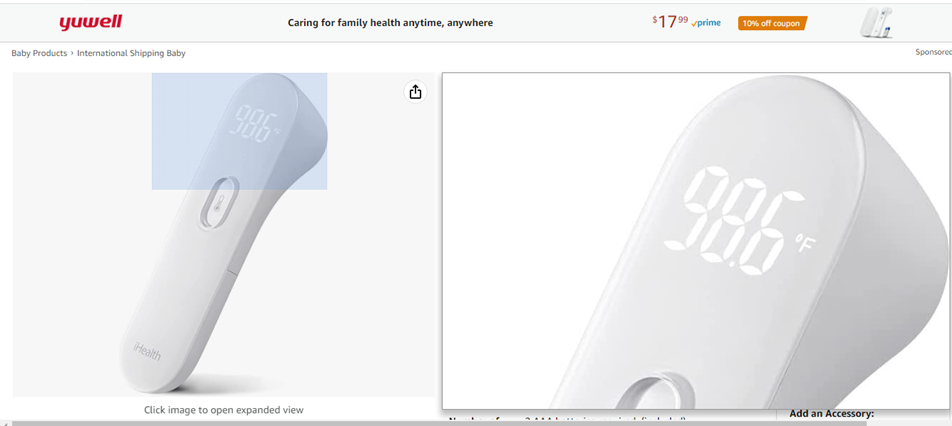
Visual appearance can impact the customer’s buying decision to a great extent. Make sure you are using photos and videos of high quality. Customers mainly look for images and live videos before making a purchase. Poor quality images can lead to page abandonment. It also spoils the customer’s impression of the products, even if they’re fine and good to use.
Image Source:
Provide options to zoom photos to a satisfactory level, to let users get all the necessary information.
Optimize product images by
- naming your images in plain language
- using model numbers in alt attributes
- showing multiple angles of your product
Read our “Amazon Image Optimization Tips” that can highlight your products in search results
Focus on faster navigation
Make it easy for customers to easily find what they need. Good navigation provides an improved user experience, which could lead to more sales and revenue. Poor navigation irritates users, leading to a higher bounce rate. Better user experience can turn site visitors in to regular clients. Consider placing the most important elements in familiar places to increase navigation efficiency, especially when your site has a wide variety of products to offer.
- Have a clear navigation menu and appropriately named sections keep your website organized.
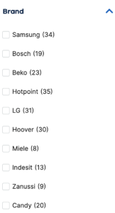
- Include a search bar with relevant filters
- Use jargon that your consumers are familiar with
- Included a clear Call To Action button, so that users can easily understand what action to take next
Make sure that the product categories and menus are easy to navigate. Check whether it is easier for customers to search for products and filter them by size, product type or color. With faster navigation, purchase can be made easier. Make the process of buying as simple as possible.
It is ideal to go for faceted search, as it helps visitors to navigate and personalize a page to find the exact product they’re looking for. Even if faceted navigation is the most user-friendly option for customers, it is not search-friendly, as it creates many combinations of URLs with duplicative content. However, filters and faceted search are not the same. While filters are applied globally and options remains the same regardless of previous selections, faceted navigation provides many filtering options to sort through various product attributes and find the exact type of product users need.
Google itself has highlighted that faceted navigation, such as filtering by color or price range, can be helpful for your visitors, but it’s often ignored. To avoid any faceted search SEO issues, it is recommended to set canonical tags, configure URLs Google can easily understand and ensure that Google crawls only priority pages.
Image Source:
Use one-click checkout feature on the products pages instead of Add to Cart, just like what Amazon has used.
Keep the layout simple
While choosing the layout and in every design aspect of the website, keep your target market in mind.
If your website has more clumsy elements, it will take more time to close a sale, which will frustrate customers. In cluttered sites, users will be confused as to where to begin. Keep your website visually appealing with a simple, clear, and clean design. Simple ecommerce website design helps users know exactly where to click to buy and thus process the sales further.
Consider simplifying the design of your ecommerce website, by –
- using a minimalistic design theme with plenty of white space
- making the payment process short and safe
- minimizing the clutter in pages
- designing a search bar and filtering tools that are easy to find
- adding your product pages with clear information and stunning media
- offering guest accounts
- designing an easy-to-maintain shopping cart
- removing any distracting links, images, or videos
- adding a clear call to action that is clearly defined a
Use the right colors
For your ecommerce store to succeed, the first step is to develop customer trust. Keep your site professional with the right color palette, footer design and font. Customers make certain decisions about purchasing your products based on the color schemes.
If you run a kid’s store, make sure to set the color, font and images accordingly.
- Choose a color for your brand and store that is consistent across all your business assets, let that be social media or business cards.
- Know your customer and apply the color psychology that can improve a customer’s mindset and prime their feelings before any sales conversation.
By using the right color schemes, you can have a massive impact on the way customers interact with your website.
Add a clear call-to-action
One of the most important ecommerce website design elements is the “View Cart” button. Having this button visible at all times while customers are shopping online has been proven to increase conversion rates.
Ensure responsiveness to all devices
Most people opt to shop online using their smartphones. By failing to optimize your eCommerce site for mobile devices, you’ll be missing millions of your customers. Responsive websites can be displayed consistently across all devices, let that be laptop, desktop, tablet, or any other.
Your customers can enjoy a consistent shopping experience. Check whether your site’s font sizes and line spacing adjust automatically to the amount of white space on the screen.
Other Key Tips
- Keep your target market in mind
- Highlight your more popular products with contrasting colors
- Follow SEO best practices to optimize your site for users and search engines
- Use relevant keywords that customers may use to search for your products
- Add easy-to-understand and accurate product descriptions
- Implement relevant on-page and off-page SEO strategies
- Add customer reviews and testimonials to each product you sell
A successful e-commerce website design will focus on key factors such as – ease of use, better user experience, cross-platform adaptability, site layout and visual design.
Need support with eCommerce SEO, website design or custom eCommerce website development?
At MedResponsive, our advanced website design services are tailored to meet the needs of your business.


