The evolution of the internet has changed the lives of people. In today’s digital world, potential healthcare customers and patients come through the internet. Therefore a good physician website design is critical for any medical practice or business. The medical business scenario is very broad and highly competitive. Even if your practice is specialized, potential patients need to know the services that your practice is offering, to make appointments. Effective website design can increase your visibility to potential patients and also help grow your practice. A user-friendly website design offers medical as well as other businesses the opportunity to communicate their business culture and mission, increase search ranking as well as make it easy for patients to see that they provide the best service. So it is important for any medical practice or business to have a well equipped website with informative content and visually appealing images that can help you stand ahead of your competitors.
A good website design begins with project planning and here are the key elements to consider:
-
- Begin with a meeting: A meeting is the best way to get everyone involved in the project. The kick-off meting can be a face-to-face meeting or via conference call. The meeting provides various ideas on information architecture, design aesthetics, and technical aspects etc. It also helps to establish clear goals and objectives for the website and what the site users should achieve.
- Home page design: The home page is significant for users in 2 ways:
- It delivers the content the user is looking for, or
- It delivers them closer to the web page that has the content
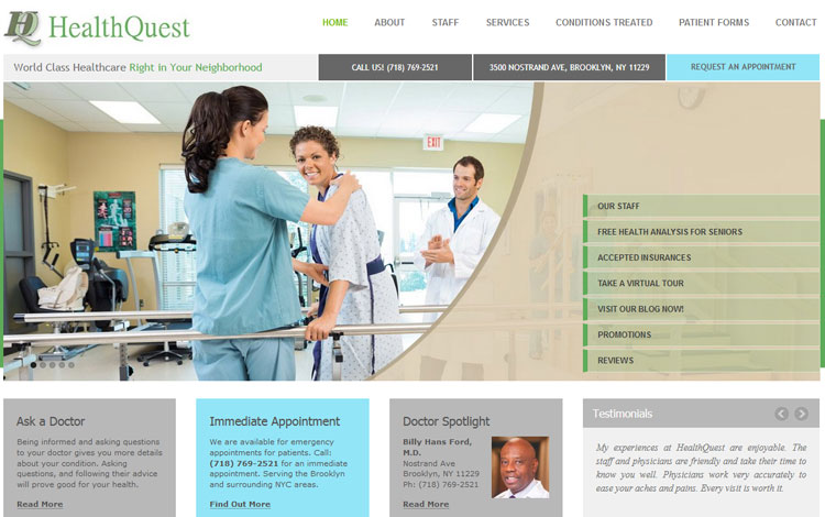
You should define the purpose of the home page when designing it and this purpose should be directly related to your website goals. The foremost question to consider is what is the main thing you want your visitors to do after they see the home page – purchase a product, sign up for a newsletter or subscribe to a membership program? It is best not to overwhelm your visitors with information but provide just enough info so that they can get to the content they want. The design of the home page varies from project to project. With the advent of responsive web design, using bulleted list for information architecture has become popular.
-
- Website navigation: Easy navigation helps users to find the required content easily. Keep your website navigation simple and obvious to be appealing to users. Visitors should be able to locate the necessary information quickly without having to wade through heaps of extra information. Website navigation should help the visitor to find all the details they want before a call-to-action can be made. Typically, navigational makeup comprises menus, icons, hypertext links, buttons and search facilities. The fewer clicks the better. Ensure that your navigation system is clear and easy to use, and comprehensive.
- Branding statement: In any website design, branding statement is the main emotionally communicative feature. It should give users an impression regarding your business and enable them to identify with the organization. Branding statement is indispensable when it comes to imparting trust and reliability.
- “About us” section: Provide your team and corporation information to emphasize the strengths of each and establish the importance of trust and relationships.
- Include social share and follow buttons: Posting valuable content is not enough for a website to attract patients. Provide the opportunity for users to share your content. So, make sure that your website has social share buttons of different social media channels at the top or bottom of your blog posts. This allows readers to share the page directly on social media. This encourages social sharing from your buyer personas.
- Do not include these items: Avoid complicated animation, very lengthy content, and stocky website images so that users are not distracted from your website and the message that you are trying to convey. Your audience’s attention span is quite short and so it is important to create a good first impression within that time. Include concise and powerful content with suitable images. Make sure it does not contain jargon or ambiguous terminology.
- Include call-to-action: Call-to-action button is an important element that indicates the next step a user should take on the page. It should direct users, persuade them to take a desired action, improve conversion rates, and help the website achieve its defined objectives. The call-to-action should be recognizable, well-defined and appealing. It should stand out conspicuously. Take care to use colors, typeface and images correctly to enhance the appeal.

- Don’t worry about white space: White space it essential as it helps to break up the page and increase readability. More whitespace will increase interaction by minimizing distractions. White space around objects will help draw attention to specific areas on your website. It can be used to make your CTAs stand out better.
- Featured content: This is variable and includes highlighted items from across the website such as events, images etc.
- Service or value proposition: This should include sections that convey your service capabilities in an informative, engaging way. The layout or style should be flexible so that more service details can be added later on.
- Sitemap: There should be a good sitemap that lists every single page on the site. It should be able to provide a streamlined user experience.
- Test yourself: Examine your conversion paths and where the users are clicking etc and find out the important elements in your website that perform well. If your website has many pages, then there may be issues with some pages. Simple changes like changing buttons colors or adding a few sentences on the page can make a huge difference in your page’s performance. Conduct A/B test or multi variant test to see what users are doing.
- Lead generation: It includes basic inquiry form with contact information.
- Communications: It includes feeds of recent items from sources like your blogs, Twitter or newsletters with links to the sources.
Web Design Trends to Expect in 2019
- Speed: Internet users are always impatient and they want the website to load in two seconds or less, or else they will abandon the website. If the website design is heavy then there are chances that the website will take time to load. Google has begun to prioritize ranking for sites that load faster than others. So, web design needs to prioritize speed during the design process.
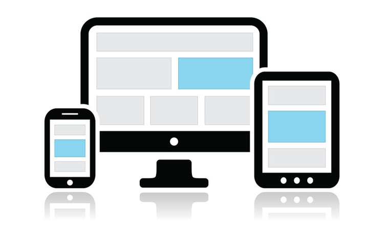
- Mobile optimization: The second most important thing is mobile optimized website. Mobile searches have exceeded desktop searches and so Google has started prioritizing mobile optimized websites over sites that are not mobile friendly. Mobile first web design is changing the way how websites are designed. It begins with designing the site for the mobile user before creating a version that will also work for a desktop user.
- Broken Grids or asymmetrical layouts: 2019 is the year where web design will be all about thinking out of the box. Web designers are now looking out for fresher and more striking website layouts. Asymmetry and broken grids are gaining more popularity today as it provides a new way not to look like other websites without making the website look sloppier. Designers can develop a new look by breaking the grid pattern and establishing hierarchy with planned asymmetry.
- Single page design: Single page web design is the new web design trend. It is also known as page less design that has only one page. All the content is placed within the same web page in a long-scrolling layout. The user experience is continuous and more fluid. Users can click on navigation links that will take them to the desired destinations on the page or scroll down the page to reach different content sections. Single page design provides just the right amount of information the user needs to make a decision and act on it. This is a great design option for landing pages, portfolios and event-related websites. Being a minimal design, it focuses the user’s attention on the most important content.
Speed, flat design, clean and simple websites are the new trends and such websites can be quickly downloaded on mobiles. - Micro animation: Micro animation will be a new noticeable trend in 2019 and it is a powerful way to provide an intuitive and satisfying experience to your users as they browse your website. Micro interaction is any single task-based engagement. It is the little animation or visual response users see when they perform certain actions – such as changing color or expanding the menu when you click on an element.
- Machine learning and chatbots: Interacting and communicating with bots has become more and more normal. Chat bots and machine learning continue to enhance user interactions with websites. Chat bots can seamlessly interact with users and provide good customer service.
- Video backgrounds: Video backgrounds are popular and can help increase conversions. Video posts are prioritized over other kinds of posts. A video conveys the message quickly and effectively and it is useful especially if you want to convey a complicated message in a short amount of time.
When designing a website for healthcare entities or other businesses, you must think from the consumer’s point of view to know what they are looking for. Having a good website helps to build up a relationship with potential patients or healthcare customers. Users rely heavily on internet resources for information and therefore providing quality information is a good way of attracting patients to your website. So many elements must be taken into account when developing a responsive website and the practical solution is to hire reliable medical SEO services.


