A UX technique known as faceted navigation, or faceted search, enables users to apply multiple facets (filters) to refine the internal search results. Users can locate what they need considerably more quickly and easily in this way. Social media marketing services can optimize faceted filters for a smooth user experience. E-commerce websites use faceted navigation mainly to reduce bounce rates and increase product discoverability. That also holds true for any other content-rich website, like those that list businesses, travel and reservation websites, stock photo websites, and job posting websites.
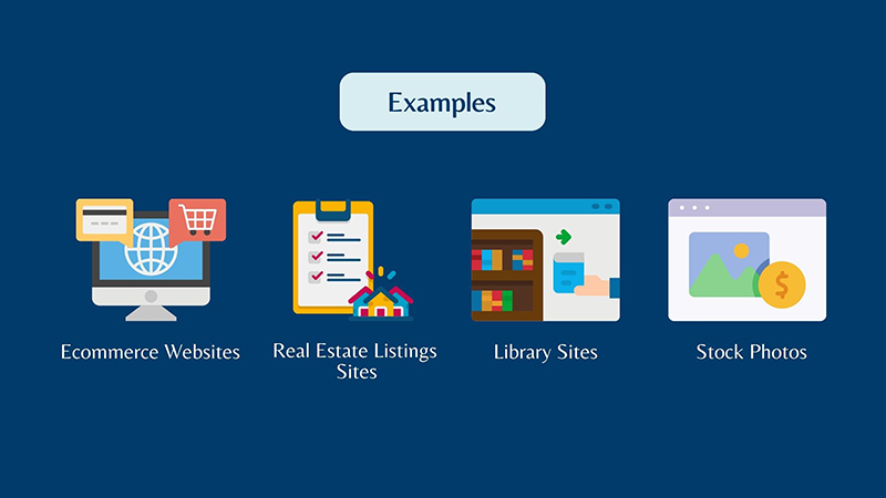
Ecommerce websites
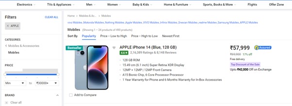
Facets that you may come across on eCommerce sites, for example, may include:
- Size
- Color
- Brand
- Price range
- Style
(E.g. Source: Flipkart)
Curious about how web design can elevate your e-commerce sales? Read our blog
(Example: Faceted navigation on Flipkart)
Library sites
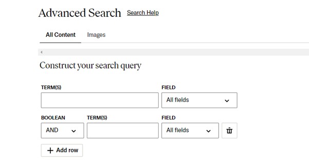
Libraries and research databases often use faceted navigation to help users quickly find the articles or research they need.
In addition to general keyword searches, JSTOR users can further refine their searches with filters for multiple criteria, including:
- Content type (article, review, book, research report, etc.)
- Publication date range
- Language
- Journal topics
- Specific journal titles
- Access type
Real estate listings websites
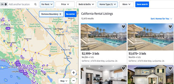
Faceted navigation is also commonly used by listings-focused websites, such as job listings directories, real estate, and travel and hospitality websites. Using their faceted search system, users can find properties that meet their preferences for
- features
- cost
- location
- availability for reservations
- kind of property
Stock photos
Sites that provide stock photos and digital assets, such as iStock, Alamy, Unsplash, Kaboompics, and Pixabay, feature faceted navigation that makes it simple to browse through millions of photos and provide searchers with relevant and targeted results.
The stock photo markets use different filters. The following characteristics allow users to narrow down their search queries:
- Image orientation
- Picture size
- The number of people shown in the image
- The ages of the people in the photo
- The release date
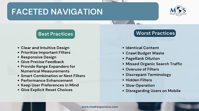
Faceted Navigation Best Practices
Clear and Intuitive Design
Make sure the faceted navigation is easily navigable and conspicuously displayed. Use easy-to-understand icons and labels for your filtering choices.Clear and concise labels ensure users understand their purpose.Design an intuitive interface that guides users on how to apply filters easily without confusion.
Prioritize Important Filters
Organize the filters so that the most crucial and frequently used filters are at the top or in a visible spot. Permit users to rearrange the filters in any order they choose.Implement a logical hierarchy of filters to avoid overwhelming users with choices.
Responsive Design
Make sure the faceted navigation is responsive and functions well across a range of devices, such as tablets and smartphones.Ensure quick loading times for filtered results to maintain user engagement and satisfaction.
Give Precise Feedback
Inform users in a straightforward manner when a filter is applied and display the number of results that match their selection.This will allow users to easily modify or remove the filters.
Provide Range Expanders for Numerical Measurements
Provide range sliders for numerical filters (price, size, etc.) so that users can quickly choose a desired range.
Smart Combination or Nest Filters
Carefully combine related filters so as not to overwhelm users with too many choices. Organizing related options can be facilitated by nesting filters.
Keep User Preferences in Mind
Provide user selections that are remembered by persistent filters, even when switching between pages or sessions.
Performance Enhancement
To ensure quick and seamless filtering, optimize the performance of faceted navigation, particularly when working with large datasets.
Give Explicit Reset Choices
Incorporate a feature that allows users to quickly begin a new search by clearing all filters with a single click.
Worst Practices of Faceted Navigation
- Identical content
When there are numerous faceted pages that are overly similar to the parent page, content duplication may become a problem. These pages are treated as distinct URLs and are indexable, so using URL parameters or static URLs could cause serious issues. This frequently results in the same content being available at several URLs.
- Crawl Budget waste
Using faceted navigation generates a ton of new URLs. The index gets “bloated” by it, and could lead to crawl budget waste. Inappropriate handling of faceted navigation can cause the crawler to spend all of its crawl budget on pointless faceted pages rather than the truly crucial ones.
- PageRank Dilution
Your PageRank will be split among all faceted pages if you manage faceted navigation improperly. This causes your PageRank to be distributed among several pointless faceted pages rather than increasing the authority of the most significant pages, such as major categories. It doesn’t really aid in ranking in this instance.
- Missed Organic Search Traffic
You might lose out on some ranking opportunities if you carelessly block every faceted URL. Specifically, it’s possible that you won’t rank highly, target some excellent long-tail keywords, or receive a sizable amount of organic traffic.
- Overuse of Filters
Don’t give users too many filter options to choose from. Concentrate on the most pertinent and widely used filters.
- Discrepant Terminology
To prevent confusion, name filters according to standard conventions and use consistent terminology.
- Hidden Filters
Important filters and options shouldn’t be hidden behind menus or buttons as this can make using them frustrating.
- Absence of Reaction
Users may become confused and have a less than ideal experience if there is unclear feedback regarding the filters they have applied.
- Slow Operation
Users may become irritated if the faceted navigation is sluggish or responds slowly. Make sure the navigation is quick and smooth.
- Incomprehensible User Interface
Confusion can result from a user interface that is poorly designed or difficult to use. To make sure the design is user-friendly, test it on actual users.
- Uncertain Reset Choices
Users may become frustrated if they find it difficult to change their search parameters or begin a new one. Make reset options simple to find.
- Disregarding Users on Mobile
If you overlook the mobile user experience, a large segment of your audience may interact with faceted navigation poorly.
Affordable digital marketing services can streamline the faceted navigation of your site for a robust customer experience. You can build a functional and user-friendly faceted navigation system that improves the overall user experience on your website or platform by adhering to these best practices and avoiding the typical pitfalls.
Optimize user experience with the best practices for faceted navigation!
Call (800) 941-5527 Now to Enhance your Digital Marketing Strategies.


