Google makes a multitude of changes every year which impact users. That’s why most businesses rely on a professional search engine optimization company to improve their rankings on Google. One of the latest updates is a new design for the Top stories carousel on the desktop website. With a new grid-based organization structure, the news section on Google.com looks different now.
Google is always working to make it easier for people to find the most useful, timely news available through Search. Google provides people with the latest news or knowledge about the world and topics they’re interested in. With the latest update, Google revamped the news top story section on desktop by grouping together and organizing multiple search results by story. This makes it easier for users to understand what’s most relevant and helps them to make a more informed decision on which specific articles to explore. Google hopes that this update will help people engage with the most relevant information and build a deeper understanding of the world around them.
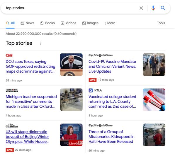
Along with box carousel at the top, the new revamped design includes double-deckers, a large featured image story with small images for other stories, and more variations.
Image Source: searchengineland.com
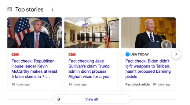
Earlier, the Google Search Top stories carousel on desktop was presented in a carousel format as shown below:
Image Source: searchengineland.com
With a list view which had stories loaded on top of each other. People knew that the Top Stories carousel referred to a “fixture of news”.
Now, the story carousel is more of a box with news stories displayed as different tiles. This update brings news results on desktop similar to how they’re presented in mobile search.
According to Google, “The new top story structure will make more room for quality content–beyond just the most recent coverage–as well as a range of sources to bring more context and perspective to the day’s news.” It also makes news results on desktop similar to what people are accustomed to seeing in mobile search.
To power this new experience, Google developed a new story-understanding technology. This technology helps depict the people, places and things involved in a news story, and draws connections between them, creating distinct groups of news articles. The articles are created using various machine learning techniques, including BERT models. The aim is to help people easily find the best articles related to a particular news story.
To help people easily navigate the results and identify the best content for their needs, Google’s research has shown that collecting results into well-defined stories is essential.
Google began rolling out this update over the first weekend of December 2021, tested some variations on desktop about a year ago and on mobile over a year ago. It is reported that Google‘s new “Top stories” carousel design corresponds with the design efforts of the mobile Top stories section launched about two years ago.
The update in the top stories carousel within Search also features key information – such as notable quotes – and related opinion pieces, which provide people a more well-rounded view of a news story to help them decide which angle to explore more deeply.
It is believed that this change is part of a longer-term effort to expand the types of journalistic contributions Google highlights to users in Search.
Publishers can get a lot of search traffic from top stories and Google’s new design could impact that traffic. Getting featured in the large image box can bring in more traffic. Leveraging organic SEO services can help publishers monitor their traffic and see whether the new design impacts it.


