In 2018, medical SEO and healthcare website design move further along the trends that began appearing in the competitive SEO arena in 2017.
2018 is set to be the year when mobile and cross-device website usability would become the defining factor. The emphasis is not on inbound links and keywords alone, but also how easy and pleasant the website is for the end user, and how a conversational search query can get the reader exactly what he wants.
Ensure the Performance of Accelerated Mobile Pages

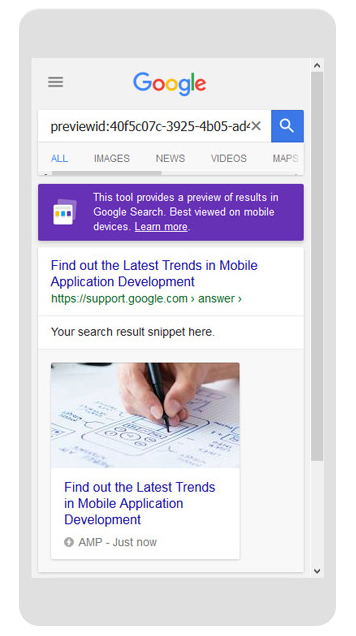
Search innovations are undoubtedly moving towards favoring Accelerated Mobile Pages (AMP). While AMP has not quite been openly announced as a ranking signal, you just can’t be without noticing its influence in search. AMPs ensure better performance from websites, and a better performing website tends to do well in search. As much as the content, how the website performs in the user’s device counts in Google’s perception of the site.
The increasingly important device Google considers is the mobile phone. With AMP, your website can load faster on a mobile screen which is a lot smaller than a desktop or laptop screen. Readers usually leave websites that take more than 2 seconds to load. So, you’re losing a great deal of potential customers or readers. That’s why AMP is important.
Focus on Improving UX on Your Website
There is greater emphasis on website design and the overall user experience (UX). We talked about that just now with AMPs that are even more suited for quicker mobile site loading and performance than responsive designs. But beyond that is the layout of the web pages that determines their user-friendliness. Are things easy to find in your site for the sincere seeker? Because websites that are hard to move around in could just be left in the dust. Users just don’t have the patience to hang around. And Google’s algorithms know that.
There is also the sheer visual delight of a website. While your visitors will look for the content in your site, they prefer the site design to be pleasant and minimalist. Attractive elements such as videos and high-resolution photographs can make the user want to visit your site, provided they have all the relevant content. They need the website to appeal to them. The advantage of a minimalist design is that users can get to the content they need faster. The absence of too many graphic complexities will also enable the site to load faster, give users the answers they look for quickly, and value their time. Too many flashy elements can only set them back.
Optimize for Conversational and Voice Search
Coming to the actual search, we’re increasingly seeing people use conversational search terms to look for stuff. And that trend is closely linked to voice search.
- The importance of voice search will only increase this year particularly with the greater use of digital assistants such as Apple Siri and Microsoft Cortana.
- There are also smart speakers, Google Home and Amazon Echo that are vital elements of the Internet of Things (IoT) and users can speak to for getting what they want.
Back in 2016, Campaign predicted that 2020 will see 50% of searches being voice searches. We aren’t far from 2020, and 2018 could experience a real explosion of voice search with Facebook also announcing its entry into the smart speaker segment this year with its Portal.
Most search phrases in voice and conversational search involve question words such as “where”, “how”, “how far”, “how tall”, “how much”, “why”, etc. Voice search phrases also contain long-tail keyword phrases. It would help for the content in your pages to be conversational while also containing all the relevant content in relation to the treatment or services you provide.
Realize the Importance of Featured Snippets
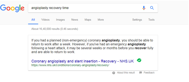
This proliferation of voice search also raises the importance of optimizing featured snippets. Featured snippets are common in the SERPs. Also known aptly as answer boxes, featured snippets are basically conceived to get the user’s question answered right away. As part of this, Google places the selected search result answering the user’s question and related information in a box above the organic results in the SERPs. The answer will have the link of the source below, so if you can optimize those snippets, you get further brand exposure.

The information in the snippets is selected from the respective web pages, so if you have relevant content dealing with all potential information a user could possibly ask regarding the treatments you offer, and if the content in your pages is presented in a conversational manner, your site could be chosen to draw the snippet content from, like the example above. And that could cause the web searcher to check out your site.
People want quick information, which is why Google launched featured snippets to help users get the information they want without having to click a site. But snippets actually do more than that. They motivate the searcher to check out the site from which the snippet has been taken.
A hrefs research states that 99.58% of pages from which snippets are taken already have a top 10 ranking. So with comprehensively relevant content presented in a conversational manner, a user-friendly interface and design that loads well on the mobile phone too, and a visually impressive but simplistic design, you can hope to get right up there in the rankings and then possibly be featured in the snippets.
Mobile Is Everything
Mobile is important, since Google could launch the mobile-first index anytime, an algorithmic update that ranks websites based on the content and performance of their mobile versions. A minimalist design incorporating AMP design, video and high resolution images but not too many complex graphics could make your site load faster on the mobile phone.
Experienced healthcare website design services can optimize your practice’s website for 2018. Better to do it earlier than later.


