The e-commerce marketplace is highly competitive and growing rapidly. Having a solid SEO strategy in place is important to rank high in search. Website design plays a crucial role when it comes to attracting customers, providing an enjoyable user experience, and driving engagement, conversion and sales. In fact, designing an ecommerce website is different from building a regular website, as it involves highlighting products and creating a seamless buying experience for the customers. Ideally, the design elements of a website should make the shopping experience and purchase process as quick and easy as possible. Professional website development services can ensure that your site is mobile responsive, your products/services are effectively presented, and visitors can navigate your site easily and enjoy a good shopping experience.
Ecommerce websites that were created several years ago and no longer conform to the present-day design standards may be incompatible or complex to browse on mobile devices and smartphones. Creating a responsive ecommerce website design can be challenging. This is because ecommerce firms usually have a large amount of information (both in the form of products and services) that needs to be presented in a way that does not confuse or overwhelm visitors. Working with an experienced provider of ecommerce website development services is the best way to tackle these issues and ensure an attractive and functional site.
How to Design an Effective Ecommerce Website
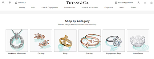
E-commerce website design must be simple, attractive, and easy to use. Clutter-free design is important to enhance the user’s shopping experience. Cross-platform adaptability and visual appeal are other important attributes of a successful ecommerce website.
Discussed below are key aspects to consider when designing an ecommerce website:
- Keep User Preferences in Mind – Every detail of an ecommerce website design – right from product pages, product images, and contact forms to checkout images- could influence the user’s decision to make a purchase. In fact, a well-designed storefront is crucial to create a great first impression. That’s why it is important to keep user preferences in mind with every single decision taken when it comes to an ecommerce website design. User experience is paramount to turning visitors into customers and customers into repeat customers. Hire professionals to check the user-friendliness of your website. Have them rate the website on usability, navigational ease, visual appeal, and overall satisfaction. A website that prioritizes excellent user experience can have a visit-to-lead conversion rate that is almost 400% greater than one that is poorly designed, according to Forrester.
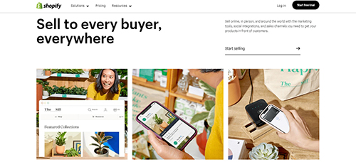
- Keep It Simple – For e-commerce websites, simple design is always better. Nobody wants to click through a lot of pages, deal with a million popups, or search for a nonexistent navigation menu. Design errors like these result in lost customers, which in turn equates to lost sales. Compared to visually complex websites, minimalist websites are consistently rated as more visually appealing and trustworthy. In order to optimize your ecommerce web design for conversions, it is important to simplify both the content and design by removing unnecessary information. Ensure a minimalistic design theme with plenty of white space. WordPress, Shopify, Woo Commerce and Big Commerce are quick and easy platforms to set up and run online stores.
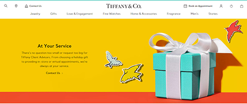
The above example clearly shows a web page with a simple design which helps visitors get to main conversion points more quickly. In this website design, there are no distracting links, images, or videos. The call to action is clearly defined and the simplistic design gives off a professional, minimalistic feel.
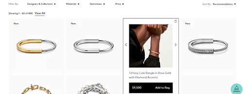
- Use High-quality Images and Colors – One of the biggest issues that online shoppers face is that they cannot view products in person before buying them. This problem can be solved by using high-quality product images. Large, high-quality images are a great way to showcase your products on a website and draw the customers’ attention. Consider creating photo galleries for each product so that users can click through them and see multiple angles of each product. A popular feature is a pop-up box where people can zoom in on a particular image and see fine details. This is about as close as you can get to allowing visitors to physically pick up a product and examine it before making a purchase. Use lifestyle images of people actually using or interacting with your products. If possible, add videos of the product usage. Using color psychology in e-commerce website design can also give customers a push to take action. Everything, right from the color of the background to what shade you give for a button can drive conversions. With the correct combination of color tones and quality images, your website can inspire emotions and motivate visitors to take action.
- Make Use of Pop-up sign-up forms – An instant pop-up sign-up form is used by many successful e-commerce companies. It facilitates r99emarketing. Because some viewers are only conducting preliminary searches, weighing their alternatives, and looking at availability and pricing, remarketing is crucial. By obtaining their email addresses, you can reach out to the prospective client once more once they’ve had a chance to consider their alternatives. They might choose your shop if you send them a brief email at the perfect moment. Just make sure you’re offering something in exchange if you’re asking for their address straight away; otherwise, they’ll probably just close the pop-up and leave.
- Optimize Your Website for Mobile – Reports suggest that about 45 percent of ecommerce shopping coming from mobile commerce (m-commerce) and hence an ecommerce website design should be planned with a mobile-first perspective. The website must include mobile-responsive templates that display consistently across all devices (from tablets to smartphones) and deliver a great on-site experience. Make sure that the website sections’ padding and margins do not disappear on smaller screens. Furthermore, font sizes and line spacing should adjust automatically to the amount of white space on the screen. Also, the website should load fast, as mobile shoppers are more likely to purchase from sites or apps that help them make purchases quickly. For instance, a Google report found that a 0.1-second improvement in mobile site speed improved retail conversion rates by about 8.4 percent. According to HotStinger, responsive websites have 11% higher conversion rates.
- Build a Simple and Seamless Checkout– Unexpected shipping costs, a complicated checkout process, and the need to create an account are three important reasons for shopping cart abandonment. As all of these revolve around the checkout process, your ecommerce website checkout page design needs to be simple and easy to navigate. Make every aspect of the checkout process clear like – the price, shipping fees (if any), the information required to process the purchase, and return policy. Other things that need to be kept in mind when designing a checkout page –
- Provide as many safe payment options as possible – like Google Pay, Apple Pay, and buy now, pay later options.
- Ease the shopping experience by requiring customers to fill out as little information as possible (only what is necessary for a purchase to push through)
- Have clear return and refund policies on your checkout pages.
- Give customers an option to check out as a guest or register for the website.
- Enable the one-click checkout option if the feature is available. (For example, Shopify businesses can use Shop Pay)
- Display Customer Reviews and Testimonials Strategically – As per reports, about 61 percent of online shoppers read customer reviews before deciding to purchase a product. Include customer reviews on your website as these are a quick and easy way to promote sales and conversions. Include product-specific reviews directly under each individual product’s description. Use social proof to your advantage as the most effective recommendation is what real customers ultimately buy. Add a rating system to your ecommerce website design and encourage buyers to leave honest reviews. Display a testimonials section on your homepage and product pages. Leverage user-generated content (UGC) by adding a widget or section of it to your website as this content serves as testimonials and proof of how real people are using the products and availing the services.
- Implement User-friendly Navigation– Convenience is the top consideration for online shopping and also one of the main reasons for shopping cart abandonment. Implementing a user-friendly and effective navigation can help customers find what they need easily. In simple terms, navigation refers to all the website elements that help users get to specific information on your website. These include the header navigation menu, product category pages, on-site search, product filters, and website footers. When implementing a user-friendly navigation, make sure to focus on these aspects-
- Website brand logo should lead to the homepage and always remain in sight
- Display main navigation menu on top of the website
- Include a search bar with an auto-complete feature or relevant filters
- Have a CTA button on each website page, especially the homepage
- Optimize Product Pages– Keep the products on your website organized into specific categories. Product categories should be easy to find through a menu bar to streamline the search process. This can also give users a glimpse into other product categories they did not even know about. Write well-crafted product descriptions that align with the brand and appeal to your target audience’s language. Optimize the product pages by focusing on these key points-
- Add more than one image of products (ideally from different angles or perspectives)
- Add keywords relevant to the product’s title and image alt tags.
- Incorporate videos (if helpful)
- Place the “Buy Now” button above the website fold and use striking color to make it stand out from the page.
- Have clear pricing
- Include optional features like – Add-to-wish list or buy-later options, product recommendations
Ecommerce website development can be challenging as there are multiple criteria to consider. A well-thought-out ecommerce website design can provide an intuitive experience for the users and thereby increase sales. This is important as 42 percent of consumers say that they abandon websites with poor functionality. So, always begin with your customers in mind when designing an ecommerce website and ensure that it’s easy for them to make a purchase. Companies providing ecommerce website development services follow the above-listed best practices to develop usable and attractive mobile-friendly websites for online businesses.


